Creating a personal logo
October 14, 2020
Poster Revision
Part 1 of this week’s assignment was to make revisions to our poster from last week based on class feedback. I made the changes the had been recommended to me by many people. I centered the winter show 2020 text vertically inside the white box, and I changed the date and venue text to stay within the bounds of their box. I also stopped the boxes from moving around as I found this to be a little annoying. In the interest of strengthing the layered feel of the poster, I added a little transparency to the boxes and the ITP IMA text.
Logo
Inspiration
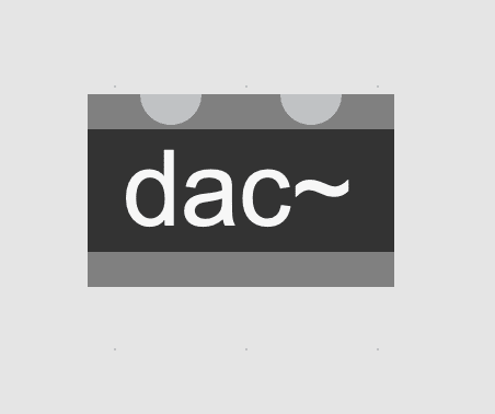
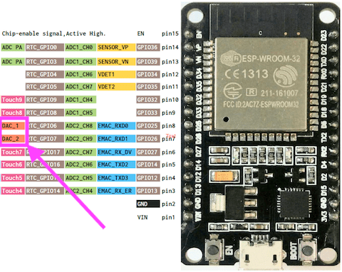
My initials are d.a.c. which in audio programming stands for digital to analog converter. I thought it would be fun to try to use this for my logo. Here are some ways dac comes up in some of the technology I use regularly.
I tried to be proactive while creating this logo by regularly exporting images whenever I reacted a new checkpoint. My unfamiliarity with illustrator came through however. After some hours of work I checked the images and realized I had been exporting them at very low resolution and they looked terrible. I tried my best to re-create them in illustrator using the trace tool but sadly it wasn’t great. I included them anyway so that I can show at least a sense of the pathway I took through this assignment.
In this first example I was trying to find a way to use the tilda character from the max example I showed earlier. I think it could have worked but I decided it’s too closely related to max in general. Also these colours are not great.
I thought instead I should try to include my name that would function as an underline (and a sort of explanation of dac).
Here I try some other colours.
I liked this design but didn’t feel like it really suited me personally.
This one was awful.
I accidentally discovered how to push letters around in illustrator so gave that a shot.
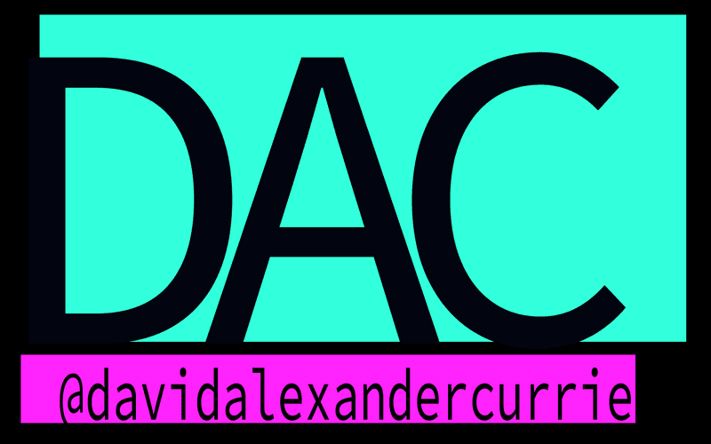
Decided for the second time around to try the name as an underline thing. Added the @ because this is the tag I generally use in social media, instagram, github etc.
Added some colours. Didn’t really like the blue.
Final Logo & Style Guide
I liked the pink so I used the colour tools in illustrator to choose an algorithmically linked colour and ended on Bright Turquoise
Written by David Currie, a current student at NYU ITP. Follow me on Twitter


